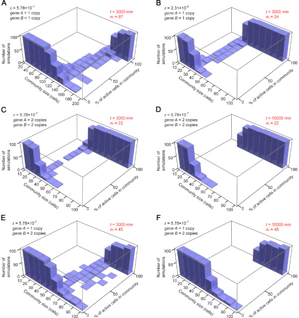
Figure 5. Community effect observed in stochastic simulations. Distributions of percentage of active cells in the community for a range of community size as indicated. 100 simulations were performed for each community size. Percentage of active cells ([Ap]> 0) at the end of simulation was calculated for each simulation, plotted as a histogram, which are combined as 3D plots. (A) The histogram for ε = 5.78 × 10 -7, a (copy number of gene A) = 1, b (copy number of gene B) = 1. (B) ε = 2.31 × 10 -6, a = 1, b = 1. (C, D) ε = 5.78 × 10 -7, a = 2, b = 2. (E, F) ε = 5.78 × 10 -7, a = 1, b = 2. (A, B, C, E) are the histograms at t = 3000 min in the simulations and (D, F) at t = 10000 min. Note that (C) and (D) are obtained at different time points from the same set of simulations, so are (E) and (F). Histograms for a = 2, b = 1 are similar to Fig. 5E and F (data not shown).
Image published in: Saka Y et al. (2011)
Copyright ©2011 Saka et al; licensee BioMed Central Ltd. Creative Commons Attribution license
Permanent Image Page
Printer Friendly View
XB-IMG-126071